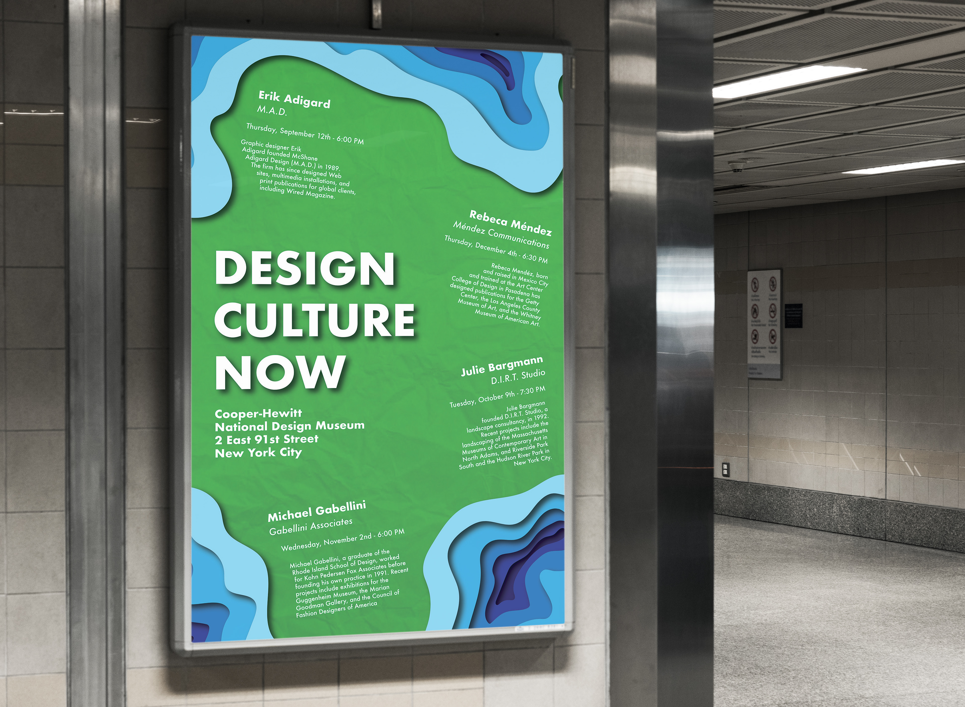
Updated Poster Mock-Up
Overview
This project is a revised version of a sophomore assignment. It was both an exciting venture into informational and editorial design as well as a challenge in properly learning how to manipulate typography in an effective and exciting way.
Process
I started out by working with my professor to see what aspects of my previous version worked well and what could be changed up. We both agreed that the design could be pushed further beyond the first version, which helped me decide to go for a more abstract version with non-linear typographical layout. I sketched some rough layouts at the beginning to get a sense of what aspects stood out and to get a sense of direction. Once this was done, I took my ideas into Illustrator and played around with paragraph structure, typefaces, layout, and accent shapes.
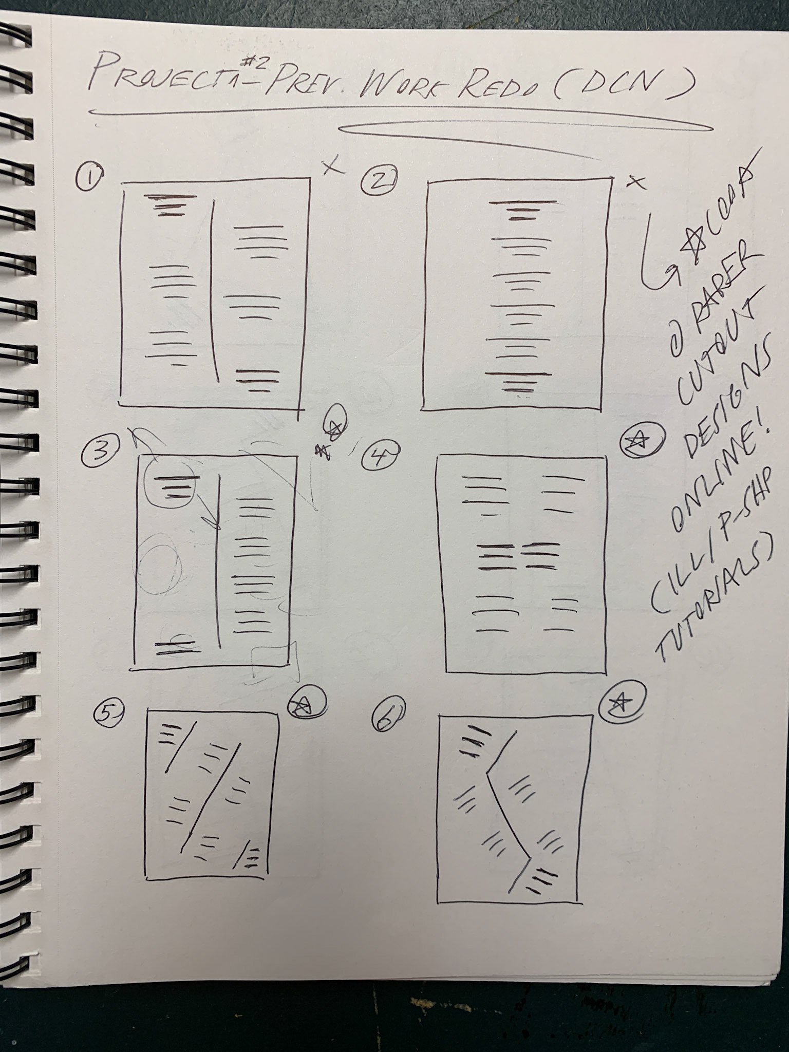
Layout Drafts
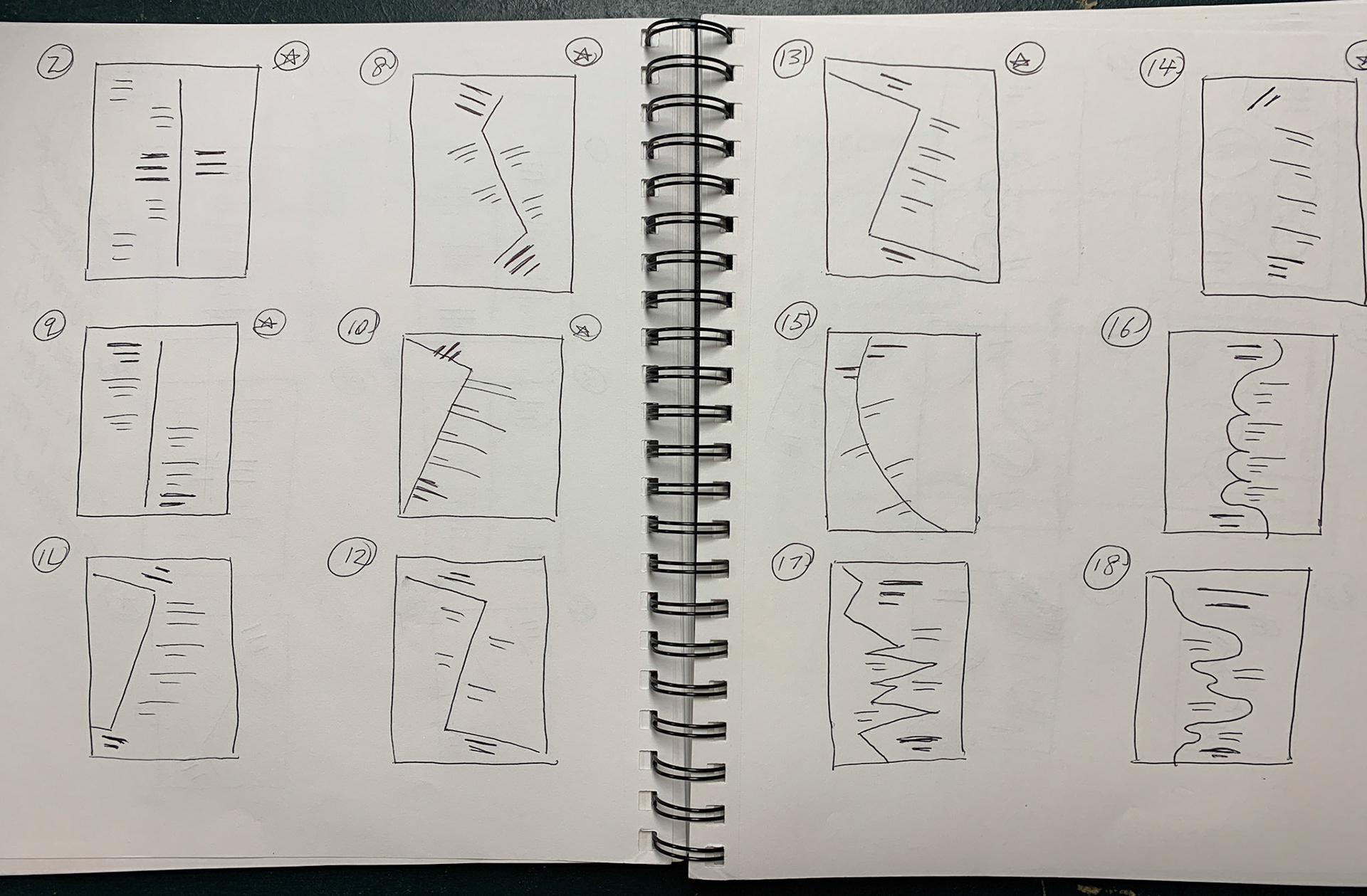
Layout Drafts
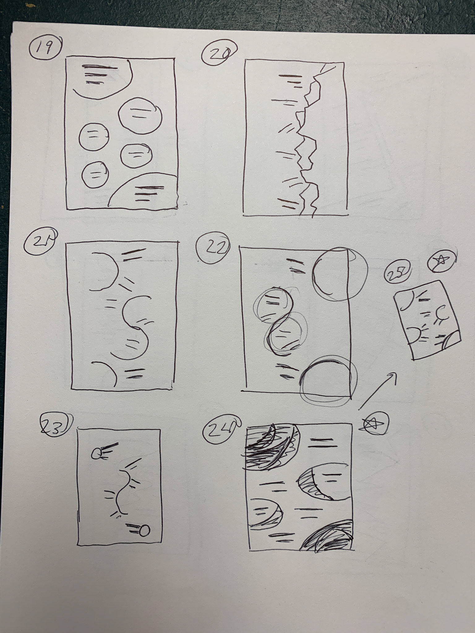
Layout Drafts
Solutions & Results
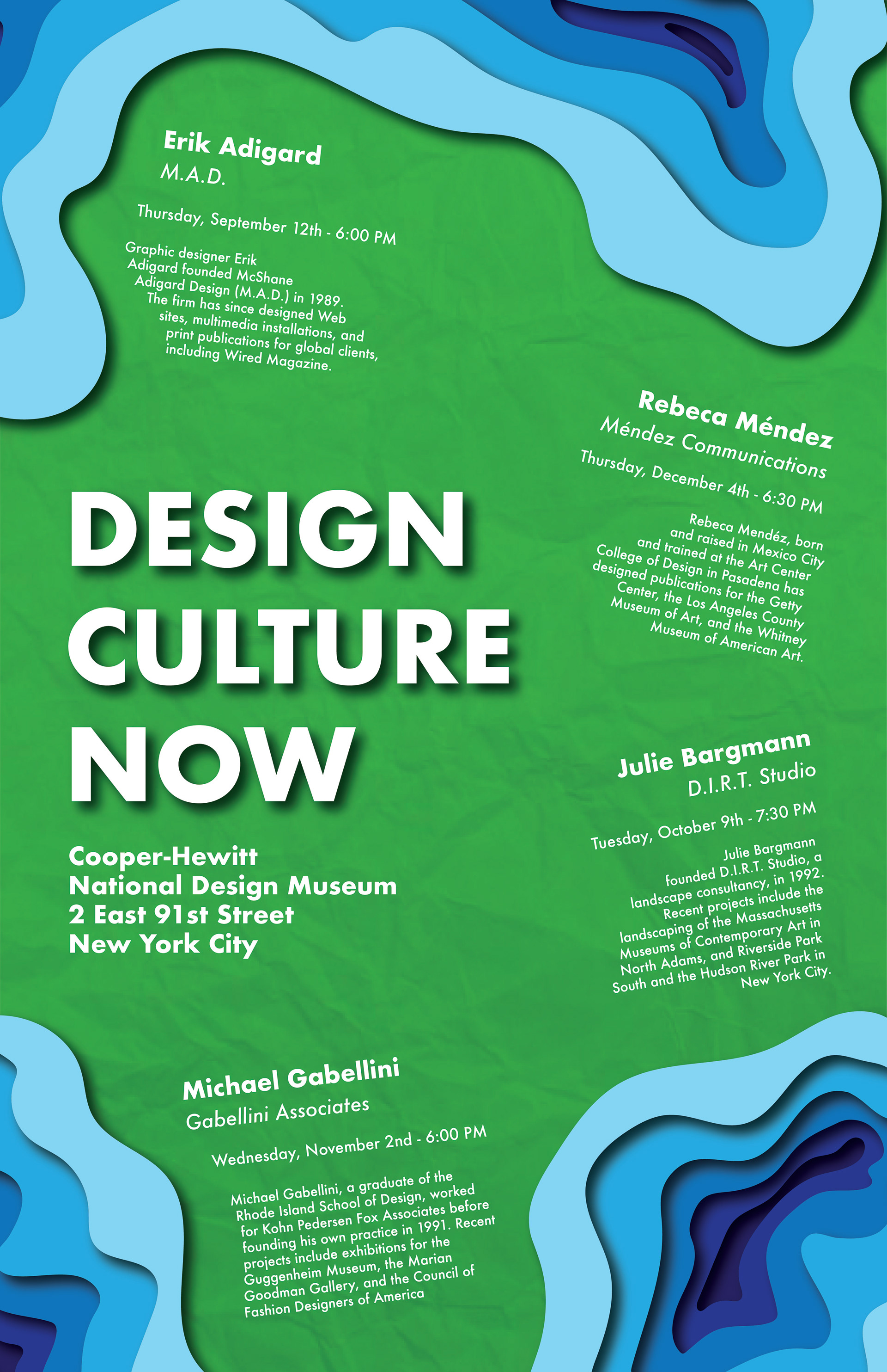
I wanted to go for something that felt more natural and organic for this version. I met this goal by using Earth-based colors (greens and blues) to convey the idea of land and water. I also incorporated my professor's idea of layered paper cutout-like shapes to give the piece a sense of depth and some added texture. Once these aspects were added in, I sized out my type to surround the event name and information. I had the paragraphs formatted to wrap around and emulate the surrounding shapes to give the poster a sense of consistent identity. Overall I felt the final product was a major improvement over the original and that this experience was a valuable learning experience on how to develop successful layouts and ideas.
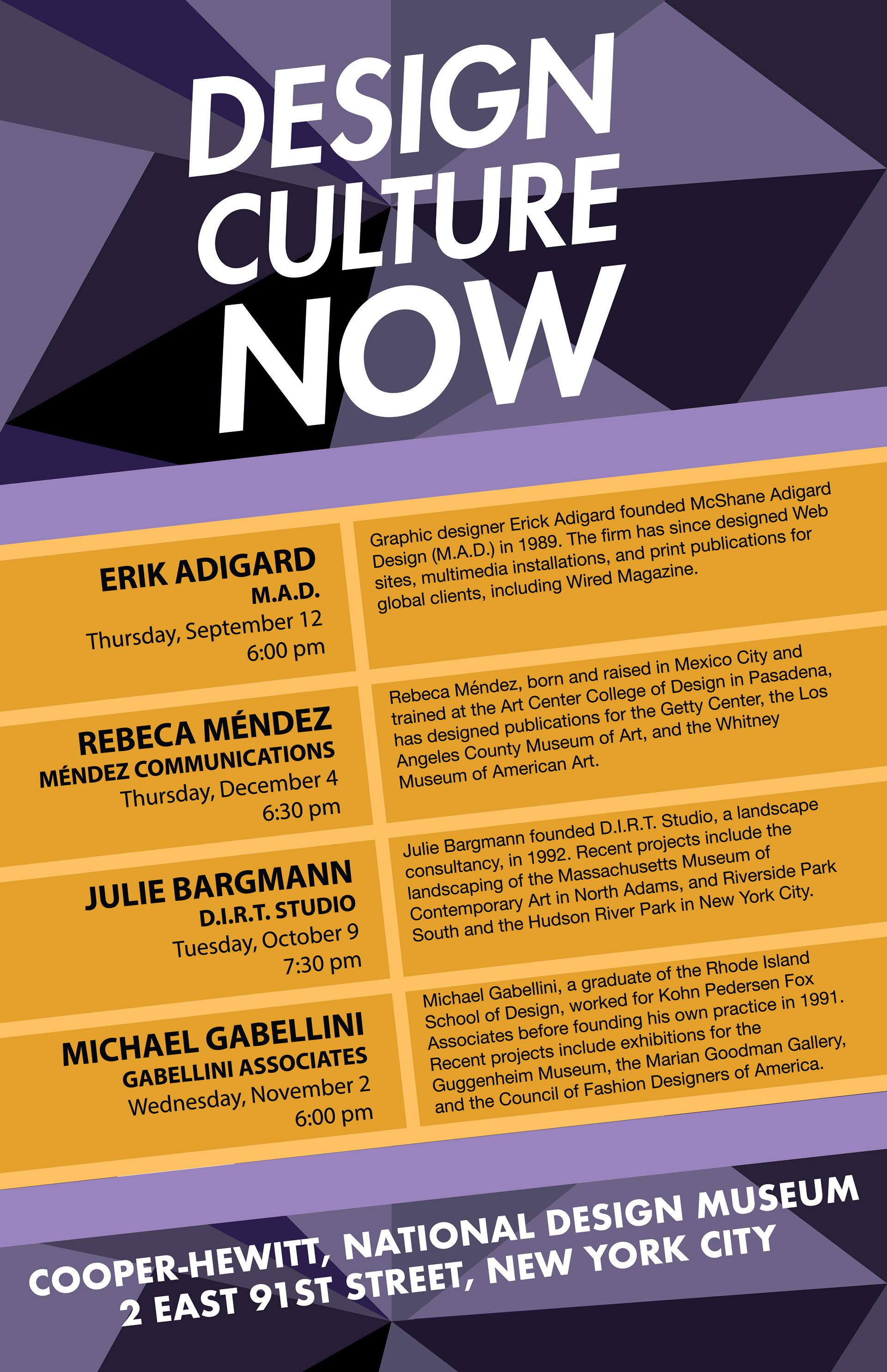
Previous Version